


StyleSeat Pre-Authorization Feature
Time frame
February 2022 - July 2022
Roles
Product designer on Team Resonance (me)
Ux Researcher, Dev Team, Product Manager, CX Manager
Tools Used

Overview
Who is StyleSeat?
StyleSeat is a booking application to help beauty professionals get more exposure to new clients as well as stay organized so they can focus on what they do best. StyleSeat mostly lives on a mobile app but there is also a desktop website as well.
StyleSeat Pre-authorization Feature
StyleSeat customers would be charged upfront, plus a little more, for their appointment with their respective beauty pro. Customers will be informed about the process throughout their booking journey and pros will be notified about their customers paying upfront and what they could expect during the entire process.
Design Process

Business Goals
- Gain back the trust of pros so we could help them receive payments in a frictionless and timely way without having to confront their customers or contact the StyleSeat customer success team.
- Increase bookings and payments through StyleSeat’s platform
- Inform customers that StyleSeat is a safe and secure way to transact
Target Users
Beauty professionals
New sign-up customers who book on StyleSeat within 0-48 hours
User research
Research Methods
User interviews
Usability testing
Research Goals
- What are pros actually experiencing with customers and what’s the reason they’re not taking payment on the platform?
- Why are customers apprehensive about paying on the platform?
- Stakeholders seem to think customers are acting in nefarious ways by purposely taking their cards off their profiles. Is this actually happening and how frequently is this happening?
How Might We Questions
1. How might we gain back the trust of our pros?
How might we educate customers on pre-authorizing their cards so they understand how it will impact them financially?
How might create a cohesive and simple booking experience that empowers our pros while also keeping the needs of our users in mind?
User Problems And Research Findings
Beauty Pros
For a while, pros have been upset with StyleSeat because they feel like they don’t listen to their feedback and ultimately keep taking money from their services with all of the fees they accrue on the platform. Here are some takeaways we gathered from talking with pros.
StyleSeat has created a sense of mistrust – pros felt a sense of mistrust with all of the fees StyleSeat collects
Confronting customers about payment is awkward – one of the marketplace rules requires that "first-time connection" appointments are checked out and paid on StyleSeat. However, like Uber, DoorDash, or any other platform with services, StyleSeat didn’t require users to have a form of payment on file. Customers could also take off any form of payment at any time. This would lead customers to pay with Zelle, Cash App, or any other 3rd party payment platform.
Dealing with flaky customers is, unfortunately, more common than we thought – pros want to know that we got their back if someone decides to not show up for their appointment. The customer experience team has told us that pros have been shouting about a deposit feature. This pre-authorization feature is essentially a form of deposit.
Customers
Through research, we found that customers are happy to make their pro's life easier if that means being pre-authorized for their service. This sentiment was strongest with recurring customers that see the same beauty professional. First-time customers were a little wary just because it was their introduction to someone taking care of something that is a part of their identity. Ultimately, they were also okay with being pre-authorized. Here are some takeaways we gathered from talking with customers.
Any form of beauty service is deeply personal – for StyleSeat, any one of their beauty pros is essentially changing the way their customers look and feel. This is a deeply personal experience that creates tension once payment is involved.
First-time customers are uneasy about committing to a service from a person they don’t know – whether it's putting their payment method on their profile or committing to the actual appointment, customers feel a sense of apprehension when getting their hair styled or their nails designed by someone they don’t know or the quality of their work.
Customers believe StyleSeat isn’t a secure way to pay for services – people nowadays are very used to sending people money directly on platforms like Zelle, Cash App, and Venmo. While those apps are definitely safe, what customers failed to realize is once they send their money via any of those platforms, we as a business can no longer help them since the transaction didn’t take place on our platform.
Having the flexibility of taking off their card on their profile is nice for customers – Stakeholders believed there was a decent amount of customers that were taking payment methods off of their profile for nefarious reasons. Our research didn’t uncover this but more so the reality that people have bills to pay and families to feed. Having the flexibility of using a different card, paying in cash, or via another platform helps them financially.
Problem Statement
Pros need financial security and to be heard and StyleSeat, in their eyes, is doing neither.
Customers are willing to help pros as long as they understand where their money is going and for what reason.
Design Decisions
Q. On the customer side, where should information on pre-authorization live, and how much information is enough information?
Answer: It should live on the “book now” screen and should be transparent about how much they’re being charged on that day.
Q. What should the touch points be for a pro and how should we educate them on what being pre-authorized means for their customers?
Answer: Pros should know throughout the booking process who their new client is, that they’ve been pre-authorized, what that means, and setting expectations for their client.
Design Solution
Customer Side

A clear breakdown of the cost
Making sure not to introduce a new pattern for our booking screens for devs, I decided it would be a good idea to visualize the cost breakdown near the service. Tooltips are included next to the “StyleSeat deposit” text and below in the payment area.

FAQ page to give the ultimate clarity
Working with the customer experience team and from the information, we gathered from interviews, we broke down the most common questions people may have and what we think they should know.
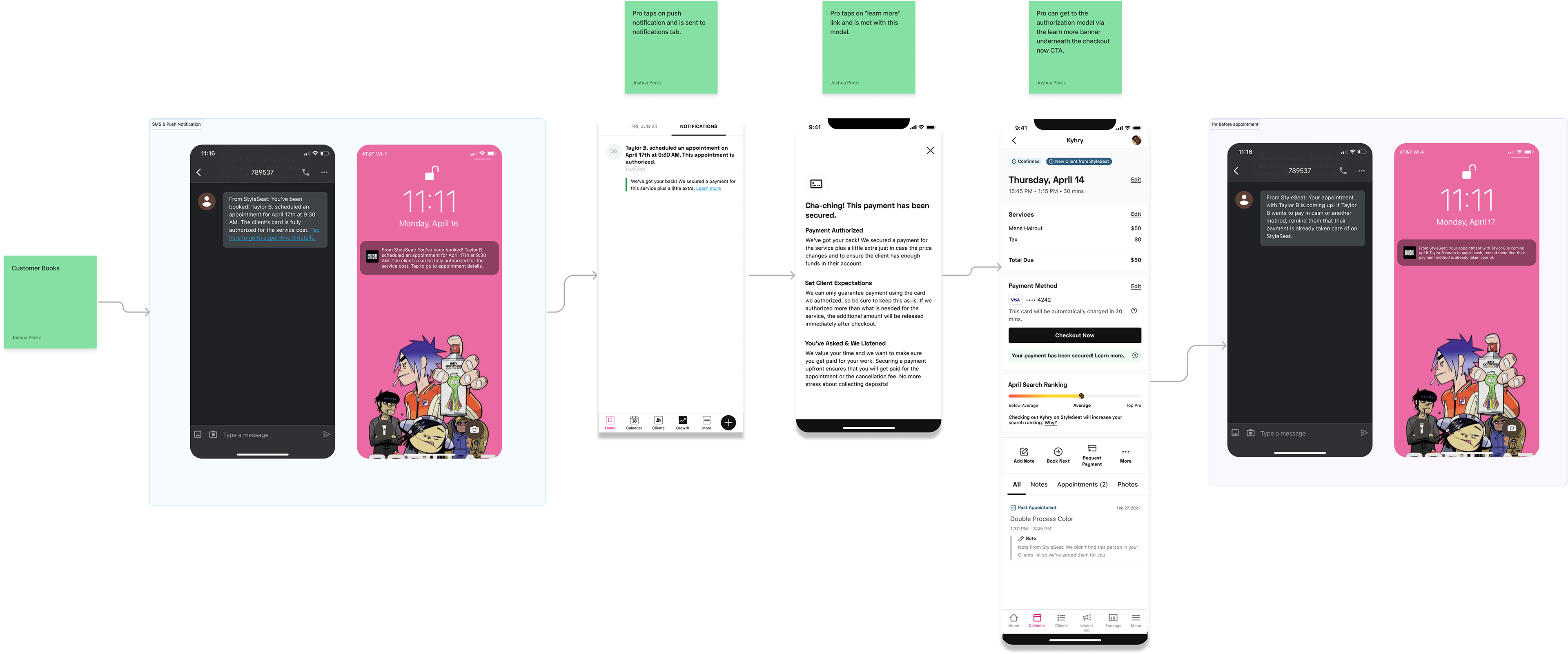
Pro Side
First Wave User Feedback
Customer Feedback
Deposits imply that money is going toward their service, which it’s not – putting a prototype of the booking experience proved people didn’t understand what was happening, mainly because financial semantics matter a ton. A deposit implies you’ve paid part of your service and you’re not getting that money back. Being pre-authorized for something means we’re holding a little extra money for a certain time frame only for it to fall off of your bank statements within 5-7 business days.
Customers were confused about the total – on the initial screen shown, customers, understand what they were paying for on that day. At the confirmation screen, we would show the total they would pay after the charge fell off. This design task truly showed how difficult it is to visualize two instances that are true but are happening at different times.
Customers fully grasped everything once they tapped the tooltip – people fully understood what the deposit meant for them and what to expect throughout the booking and service process. Proving that the FAQ page is valuable and would be necessary down the road.
We’re competing with ourselves – customers were saying they felt overwhelmed with the amount of information that’s displayed on the booking page while keeping in mind that there's a timer at the top of the page informing them how long they have until their appointment day/time is lost. We realized that we’re actually competing with ourselves as the countdown banner has proven successful at converting.
Pros Feedback
Pros felt relief that they were finally being heard – a form of deposit was finally being introduced to the platform and pros couldn’t be more excited. We were on our way to impacting the financial success of our pros and that felt fantastic.
Touchpoint timings are the keys to their success – From when a customer books, to when the customer is on their calendar, the day of, and all the way at checkout, pros want to be reminded that their customer is being pre-authorized.
A/B Testing
On the customer side, we felt we still needed to tweak the designs a bit more.
Test Goals
- Which design achieves the best financial comprehension and timing of all transactions?
- If we limit the amount of information on the screen, will people still be able to understand what is happening?
- Introducing the verbiage “pre-authorized” and how well it’s received
Design B


The biggest difference here is that the total is now underneath the payment method. Including it in proximity to the customer’s credit card felt like a better design choice as customers often double-check their card info before booking. This felt like it had a better chance to be seen. Additionally, the tooltip now leads to a modal explaining simply, what pre-authorization means and how much they’re being charged that day and at the end of their appointment.
Test Results
The B design was well received and the tooltip modal provided a lot of clarity. Here’s what was working.
Including the price for the day by the payment method section – It almost always leads to them tapping the tooltip
Tooltip modal provided enough clarity without confusion – the modal information made customers understand that today’s price is not tomorrow’s price (points if you know this reference 😉)
Final Design
Ultimately, the team and stakeholders were satisfied with the user feedback so we pushed forward and implemented the following screens.
Pro Side

Customer Side


Results: 20% increase in payments on our platform. 10% increase in bookings.
Takeaways and Future Design Iterations
This project truly focused on user needs for our pros while also providing clarity to users. It felt great to help pros retain all of their hard-earned money while also helping the business. It was also an incredible display of how challenging UX writing can be. Financial semantics meant everything as well as the timing of displaying that information.
Sometimes, it’s rare the business and the needs of users end up in a win-win scenario and this one felt like a win for everyone.
Down the road, stakeholders liked the FAQ-style page and wanted to include it in a resource section for customers and pros.
If I had had more time, I think I could’ve reworked some of the copy as well as the visual treatment. Here are some different iterations I personally liked.

